EL EZABY PHARMACY
A well established pharmaceutical brand established in 1975, recognised as Egypt’s leading provider of health and personal care products.
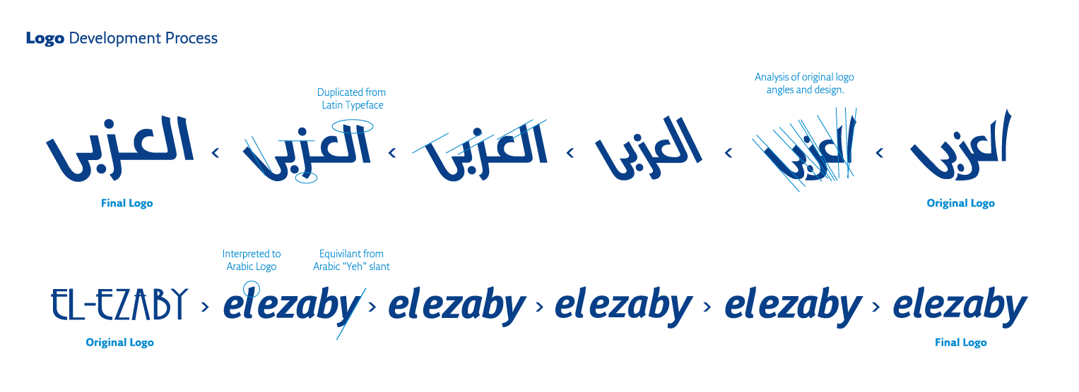
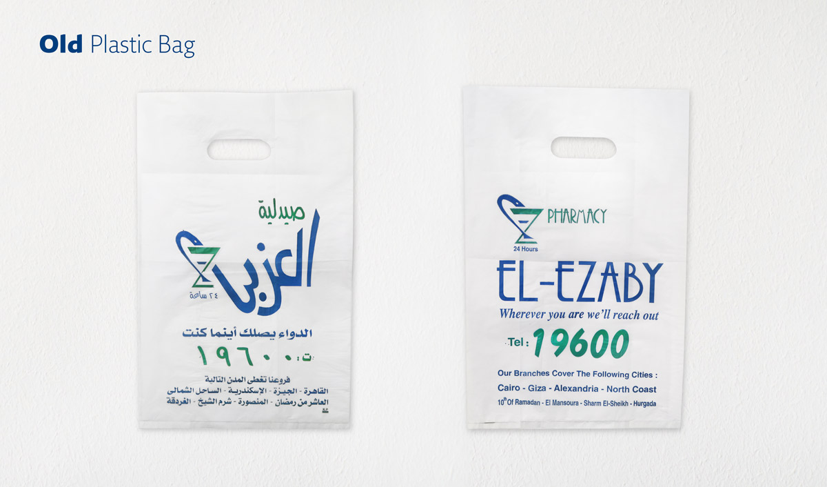
Known by their unique typographic logo, they cemented their identity with this mark which they maintained for 38 years.
In 2013 they decided they needed a facelift that would not stray from their original mark but develop to what their brand needs today. A strong, well established bilingual brand which is spread throughout Egypt.


BRIEF
Designing the brand identity, redesigning the bilingual brand logo, while maintaining original aspects of the Arabic logo and creating consistency with its Latin counterpart. Along with designing various applications of the identity.
OBSTACLE
Maintaining the originality of the logo while being able to define the typographic parameters according to undefined thicknesses and angles. An analysis of both the thicknesses and angles was important to determine which attributes will be essential to maintain originality while facelifting the logo.
MERCHANDISE
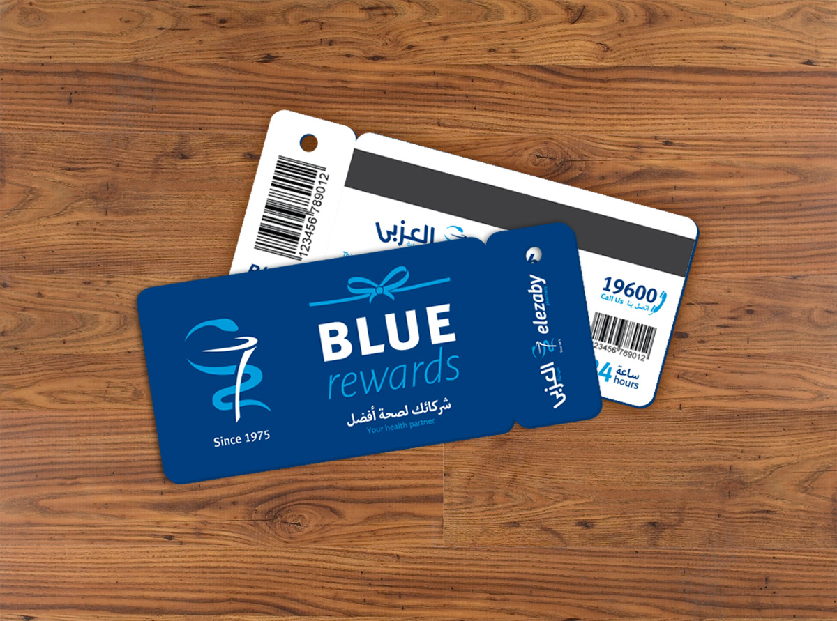
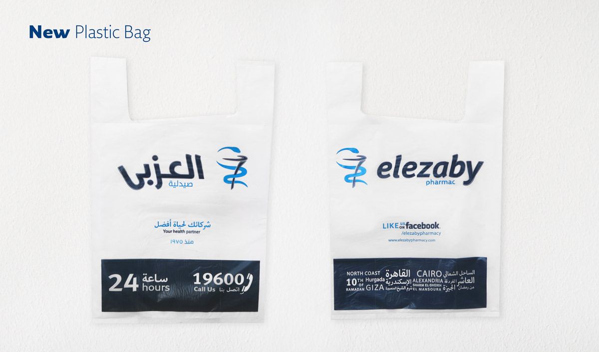
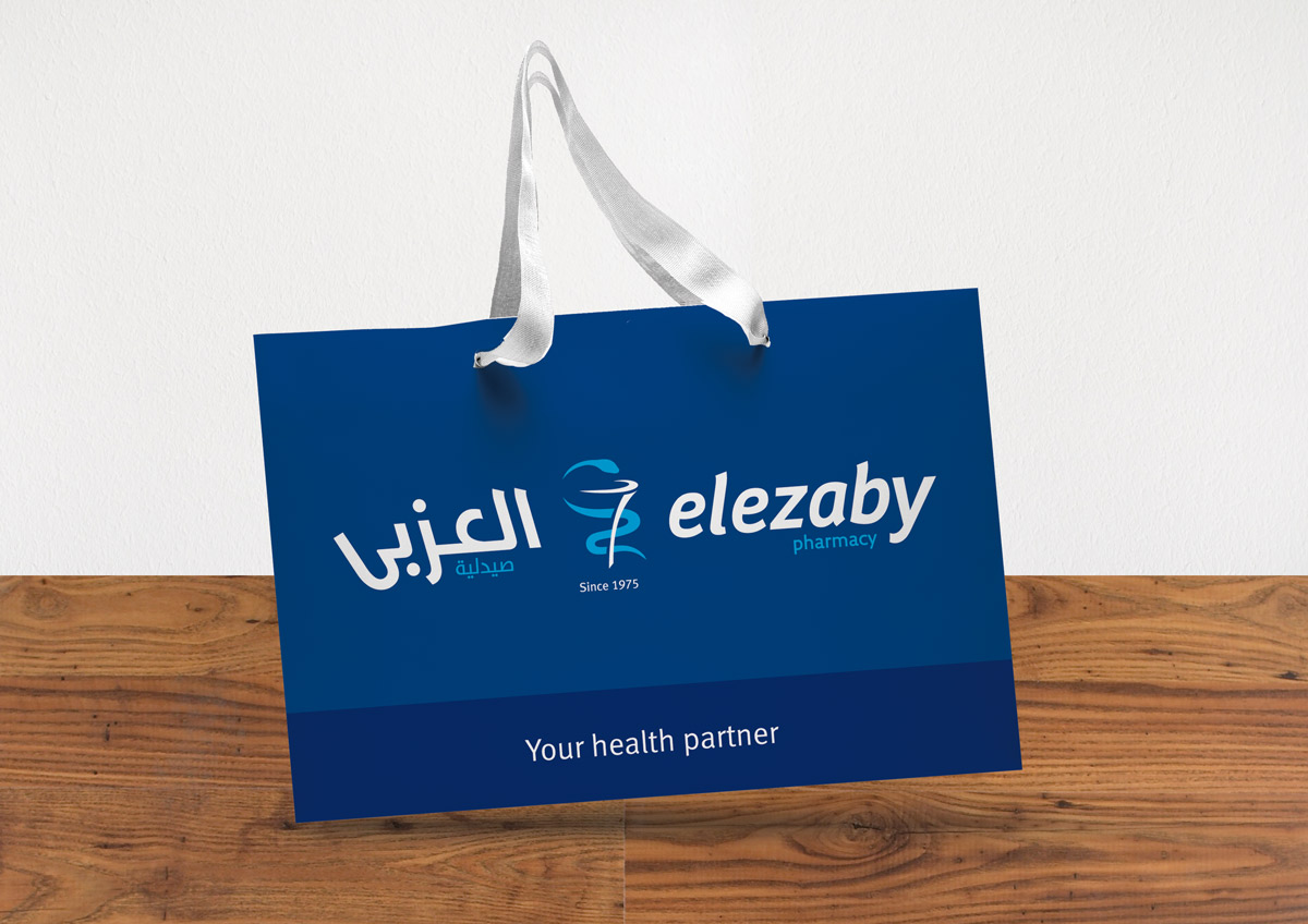
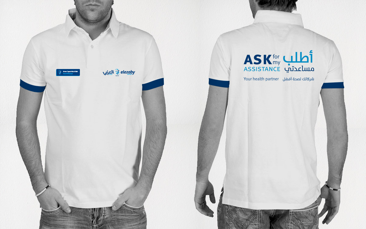
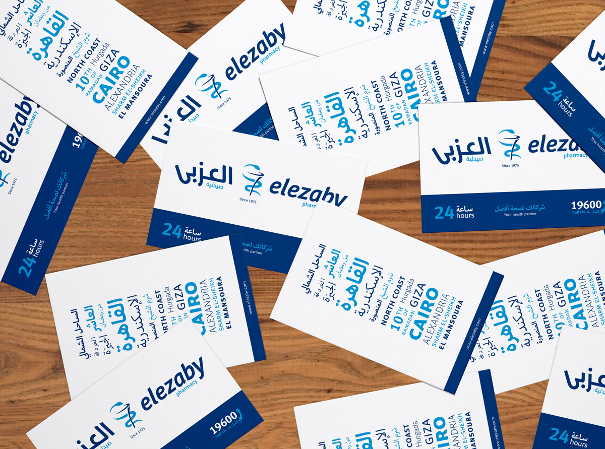
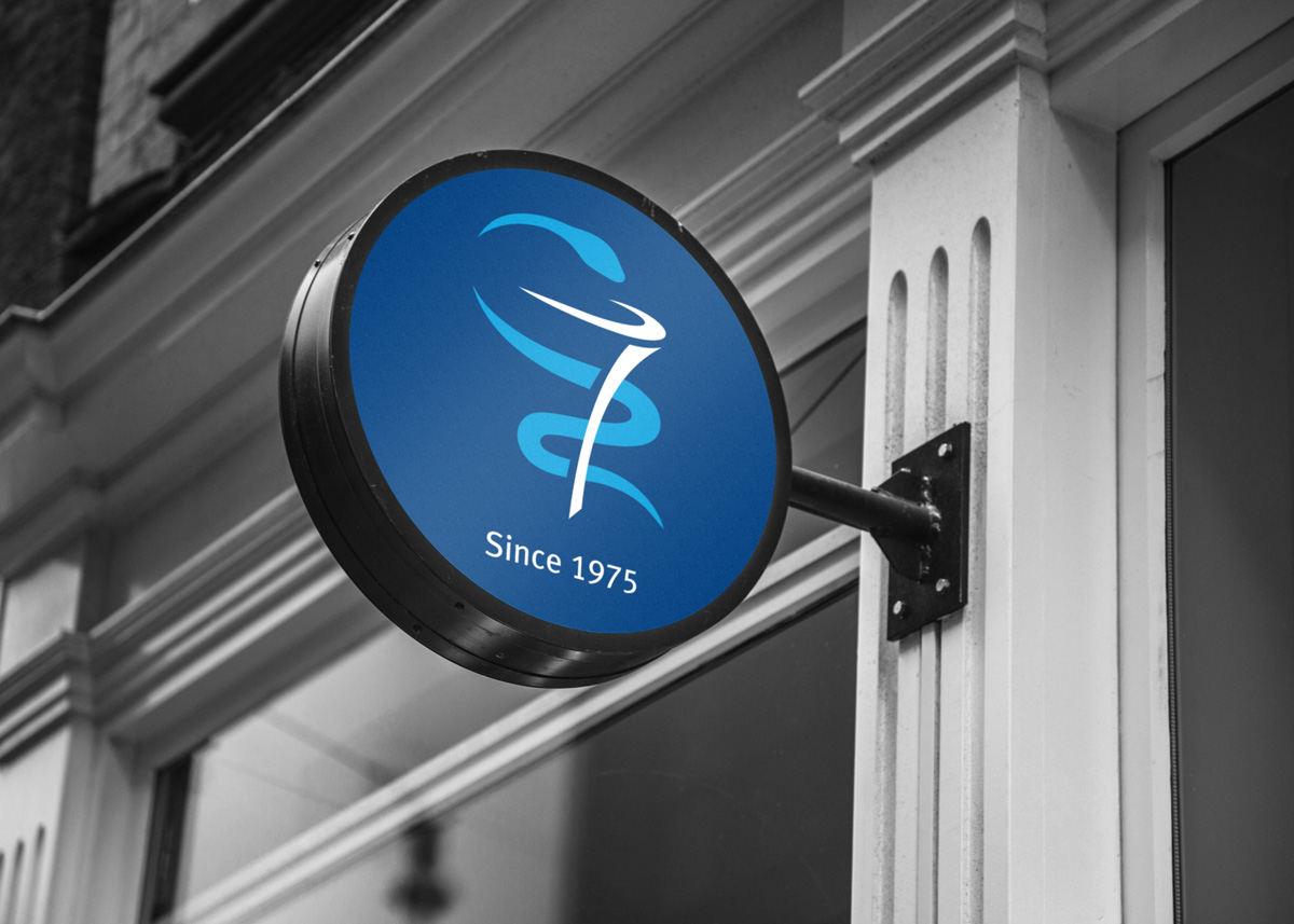
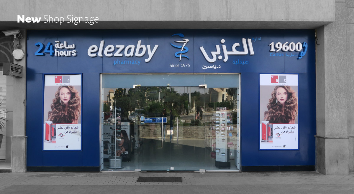
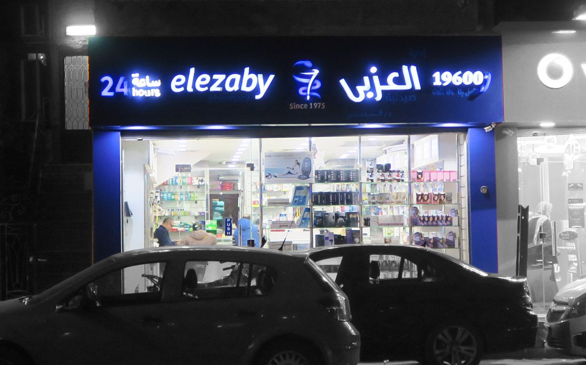
SHOP SIGNAGE
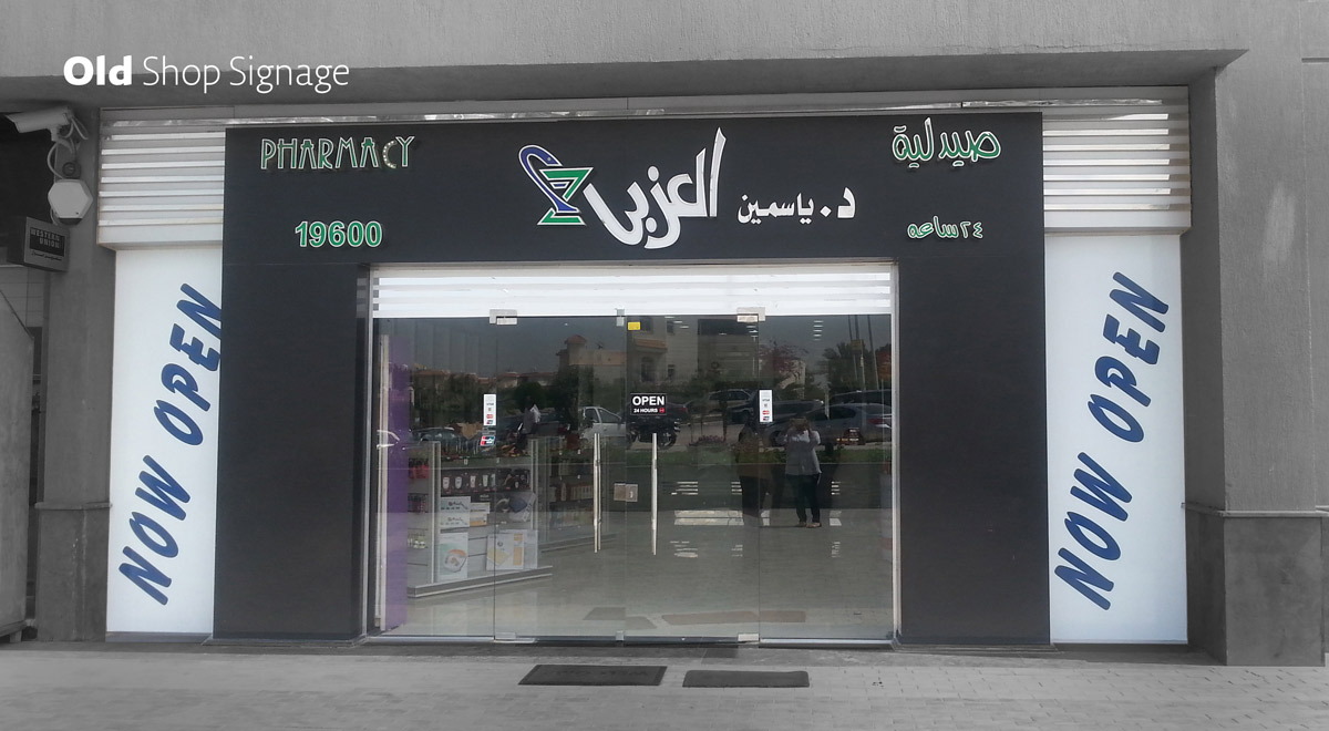
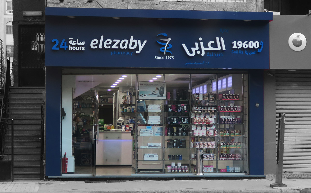
Since El Ezaby is a well established brand it already has numerous stores throughout Egypt. Applying the brand identity to the stores took a thorough analysis of the different layouts of the storefronts, to be able to establish a design combination that would be applicable across a variation of sizes and shapes. There was a big variation in size which would affect the items needed on the signage and the size of the logo.
Moreover the materials and colors for the signage was put in consideration according to the maintenance and weather and though the white was a main color for the brand the navy was the best decision for the signage.
DELIVERY SCOOTER
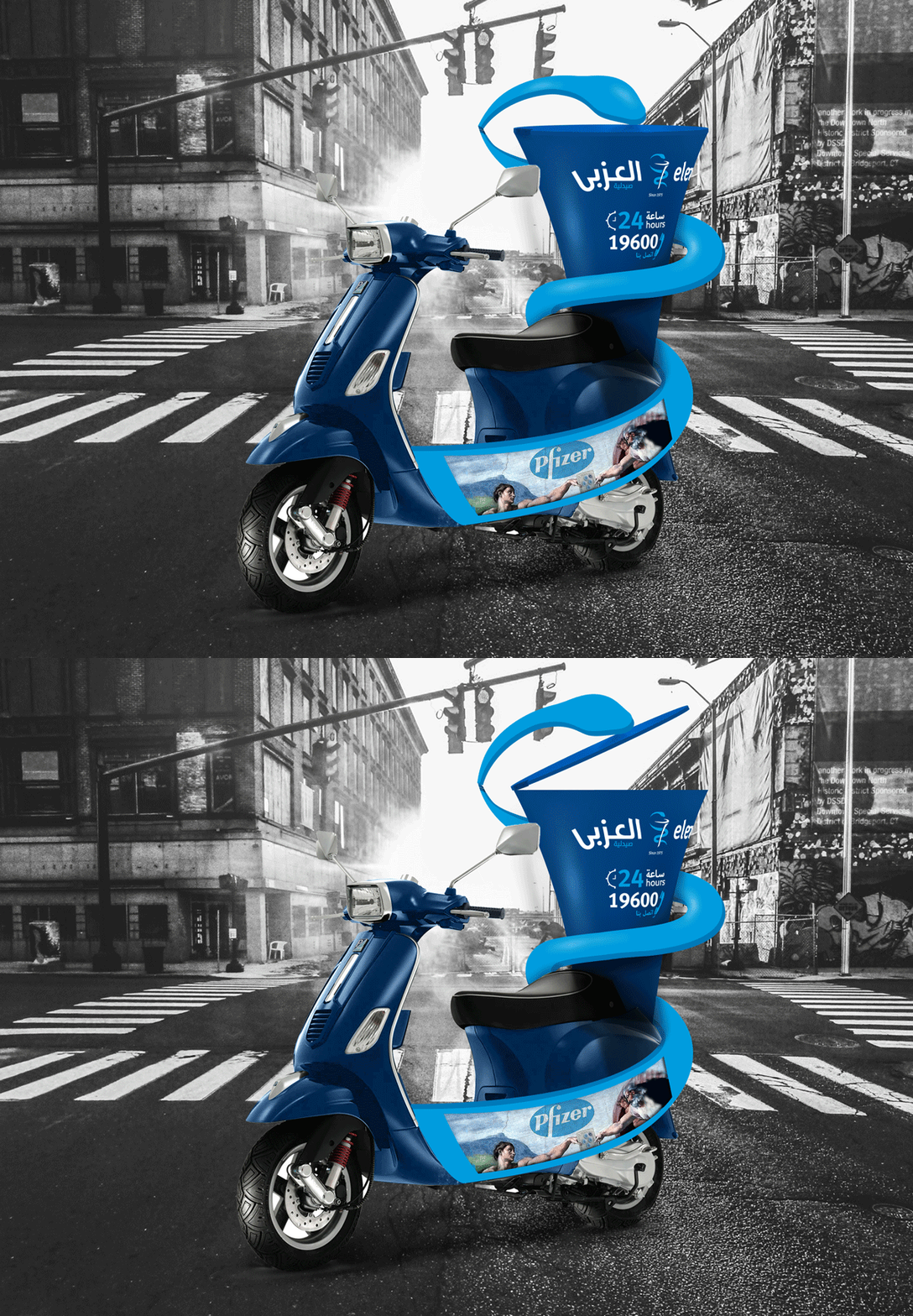
Being a pharmacy which caters to clients all over Egypt their delivery method was suggested to be brand inspired. In this case it was inspired by the brand icon, so it was to be formed as the snake and chalice, the snake being the part that assists in opening and closing the box. Shown right.
Simulation by Islam Zawawi
THE CAMPAIGN
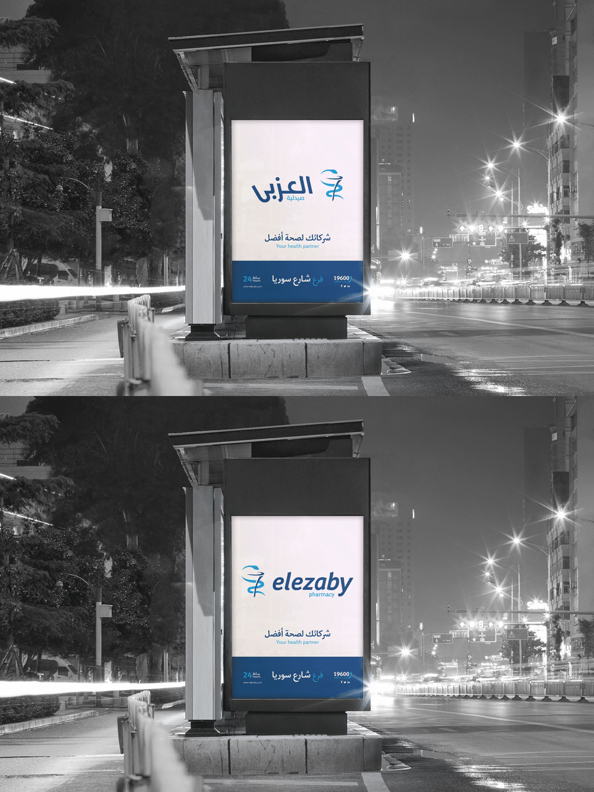
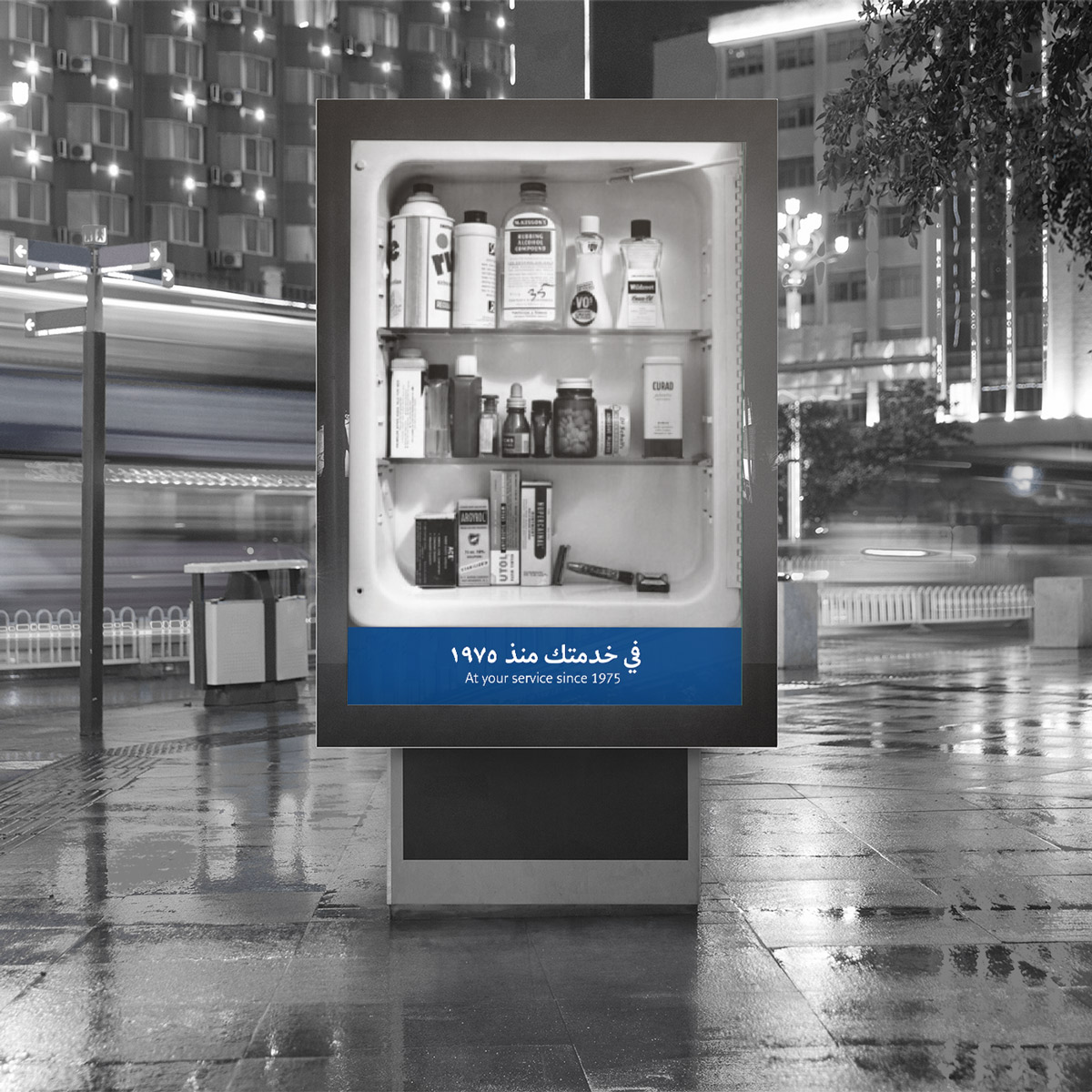
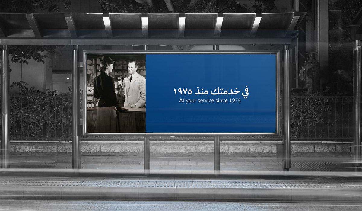
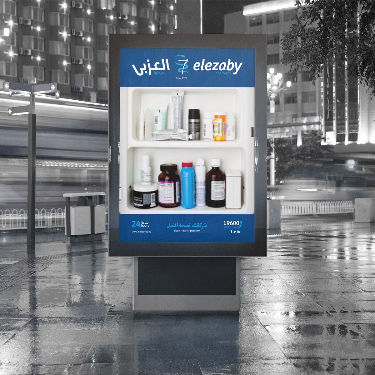
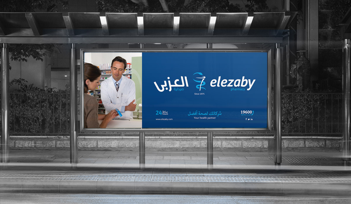
The campaign was a teaser to reveal the new identity of El Ezaby, and to recognise their success since 1975.
The campaign was showing vintage images of pharmacist helping a client, later the reveal a similar relation between the pharmacist and the client 38 years later.
The second part of the teaser campaign was a picture of an old medicine cabinet with older medicine bottles and the reveal would be of a new medicine cabinet with medicine we use today. This campaign was mainly to be presented on advertising boards, where one would feel they are looking into a big medicine cabinet.
Campaign presented below; Teaser shown on the Left and the Reveal presented on the Right.
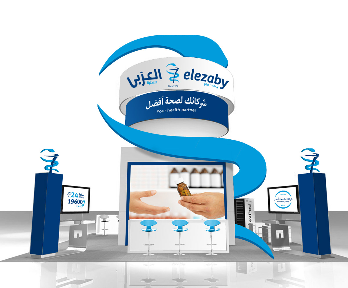
POP-UP STAND
El Ezaby pop-up stand, was designed mainly as a prototype as a portable visual to be presented in pharmaceutical conferences, job fairs and other events. As a way to grab attention and give the experience of the brand, clean cut and well established.
