GRANSHAN CAIRO, 2016
Granshan is the hub for global visual identity. The conference celebrates typefaces, typography, and communication design that enable communities to develop culture and enterprise in a balance between local, regional, and global.
The annual conference is a forum for exchange and learning about designing for environments that respect complex social and personal cultural histories, and respond to a world that grows at the same time more interconnected and intimate. Bringing together speakers with global expertise and local knowledge, to discuss how design can change communities, give focus to enterprise, and underpin regional identities.
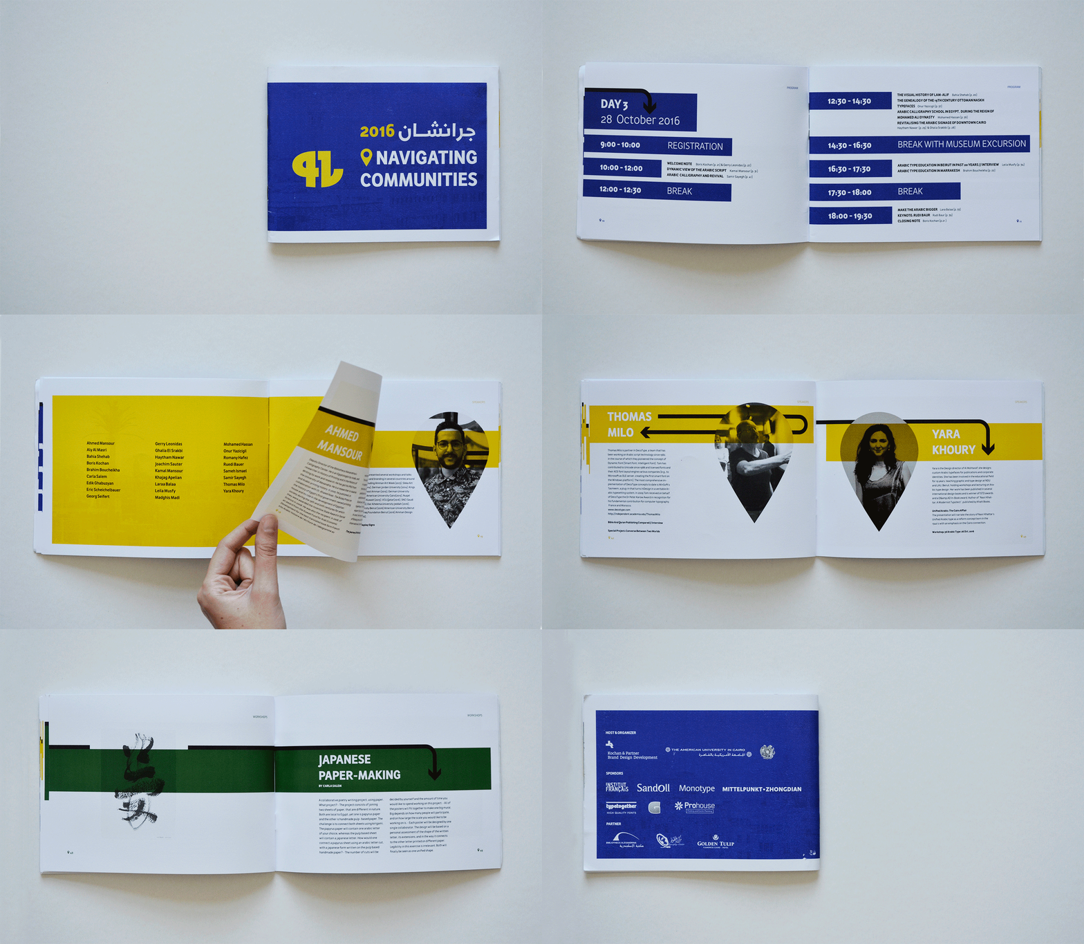
The theme of the 2016 conference which was held in Cairo, Egypt was “Navigating communities”. The programme was developed around the interaction of typefaces, texts, wayfinding, and the text-based systems we rely on to navigate daily through physical and virtual environments.The Latin typeface used is Awan Zaman by Type Together. The Arabic typeface used is Razeen Sans by myself.
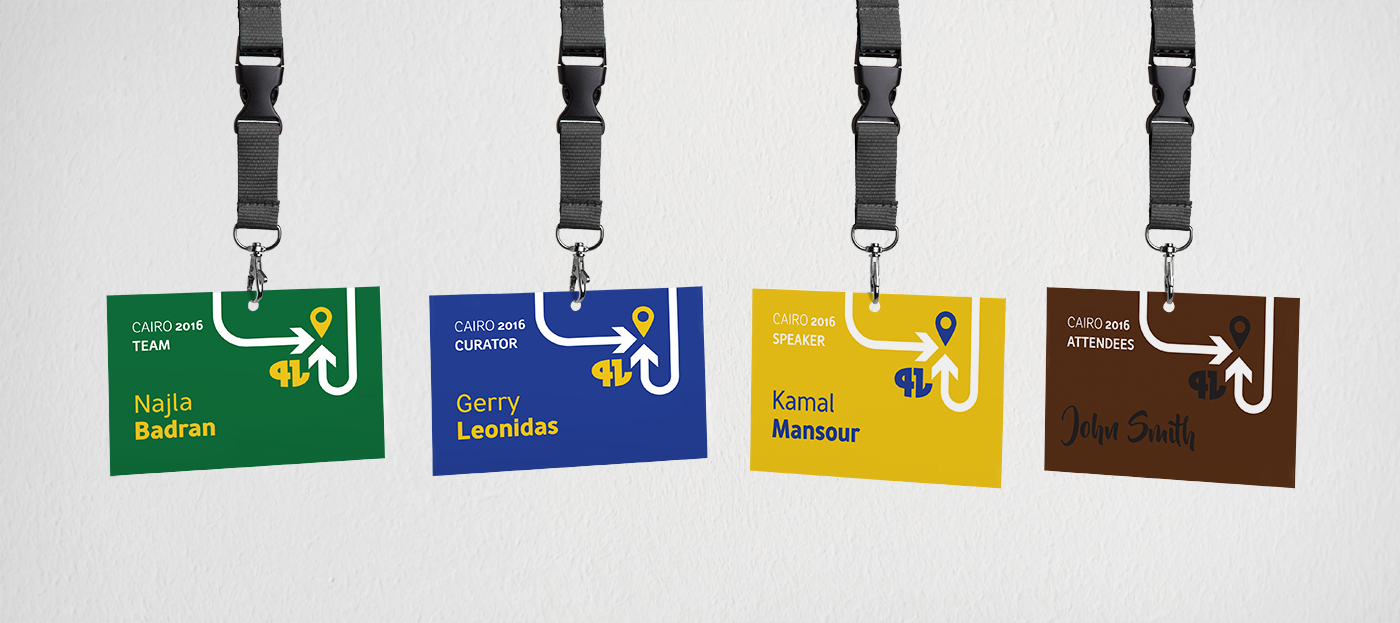
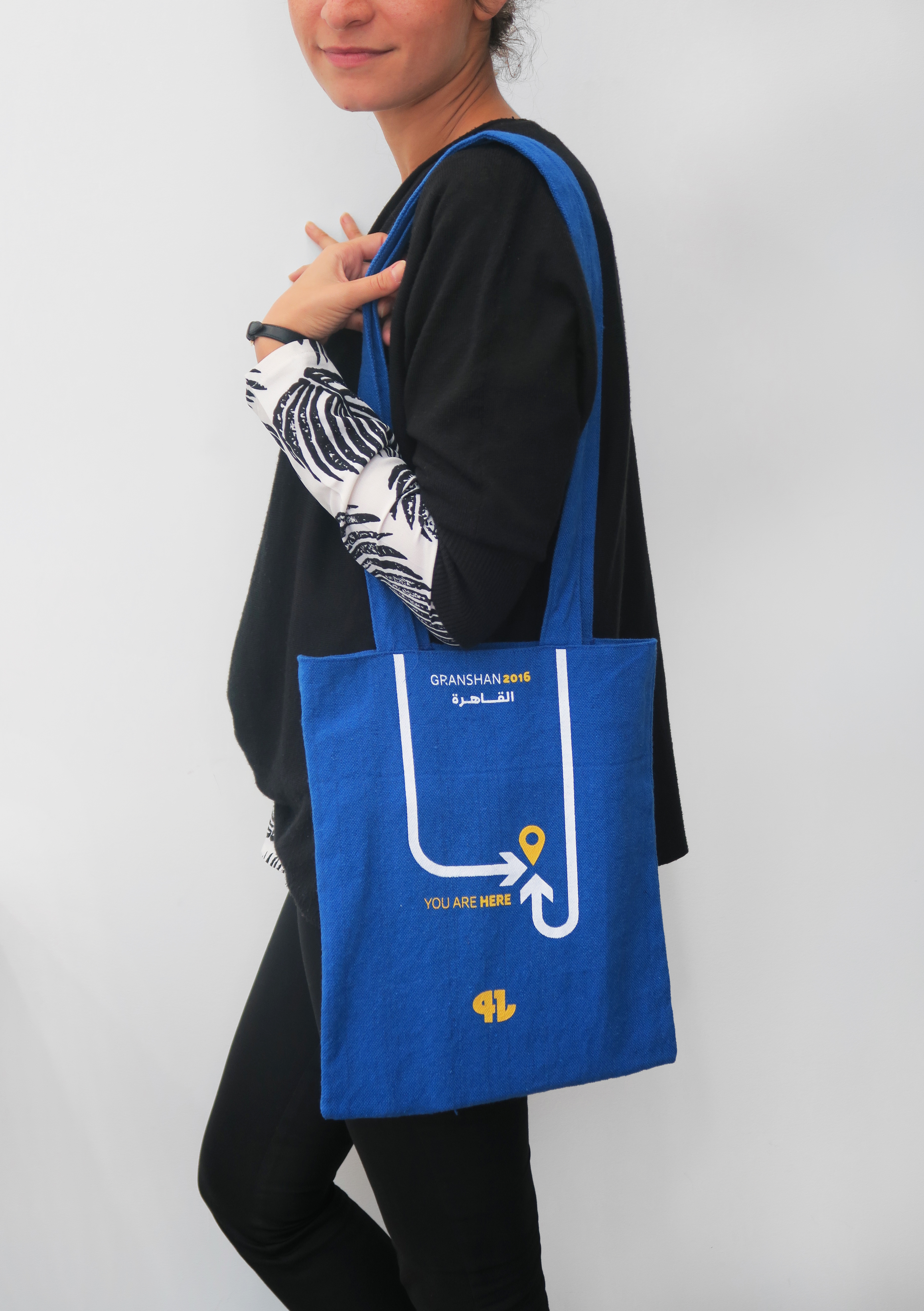
I was assigned to design the visual identity for the 2016 Cairo conference, which meant designing the bags, brochure, lanyards, way-finding, and more.
To find out more about GRANSHAN Competition 2016, please visit: granshan.org
Inspiration
Since the theme of the conference was “Navigating Communities” the inspiration behind the identity of the conference was bilingual street signs. Hence the colors were mainly depicted from the main color of Egyptian street signs blue, which was accompanies by yellow and white as the main three colors to be used for conference communication. Later on, the yellow was introduced as a secondary main color to represent the speakers. Furthermore, in many cases some street signs include green which represents highways and brown which represents Egyptian monuments. The color green was integrated to represent workshops while the color brown was to integrate films to be shown at the conference.

